Brand
Brand kit
The official NimboCDN files and the rules for using them. Everything is here so nobody has to crop the logo out of a screenshot.
476 KB ZIP · logos, icons, colours, typefaces and the licences
1. The name
NimboCDN is one word, with a capital N and CDN in capitals. No space, no hyphen, no all-caps.
- Right: NimboCDN
- Wrong: Nimbo CDN · NIMBOCDN · Nimbocdn · NimboCdn
"CDN" may sit in a different tone from "Nimbo". It is the category, not the name, and the tone shows where the brand ends without adding a space. In one ink they match: a tone does not survive a single colour.
In running text, write the full name on first mention. After that "NimboCDN" alone is enough; do not shorten it to "Nimbo".
2. The logo
Four pieces. The horizontal one is the primary: if you are unsure, use that.


One ink
Every piece has a single-ink version: positive for light backgrounds, negative for dark ones. In those the block is knocked out, not painted white — so the substrate shows through. Painting it white would only work on white paper; on coloured stock, on an image or on any coloured background, that white reads as a patch stuck on top.


What the symbol says
The block is an image that loses 32% of its height. That mass reappears below as the lime edge it is delivered from. The 32% was not chosen by eye: it is the measurement the product publishes. AVIF needs 32% fewer bytes than JPEG, measured across fourteen images from two real stores at equal perceived quality. If that measurement changes, the symbol changes with it. It is not a decoration shaped like data: it is the data.
3. The favicon carries no glyph
At 16 px there are 256 pixels in total, and there the sun and the hills melt into a smudge that dirties the block. That is why a separate file exists without the glyph, and it is the one to use from 16 to 48 px.
| File | Shape retention at 16 px |
|---|---|
With glyph (nimbocdn-symbol.svg) | 0.807 |
Without glyph (nimbocdn-symbol-small.svg) | 0.882 |
Measured by rasterising to 16 px, scaling back to 256 px without interpolation and correlating against the native render. Simplifying a symbol at its minimum size is standard practice, not an exception: at 16 px the only thing that has to survive is the silhouette.
4. Clear space and minimum size

Three of the symbol's 24 units on all four sides — that is, one eighth of its height. It comes from the height of the lime edge (1.5 u) doubled. That is an element of the symbol itself, not an arbitrary number. The clear space grows when the mark grows.
| Piece | Minimum | Why |
|---|---|---|
| Symbol | 16 px | It is the favicon, and at that size it goes without the glyph |
| Horizontal | 96 px wide | Below that the wordmark drops under 10 px of optical box and stops being legible |
| Vertical | 72 px wide | The same |
In a tight layout, increase the space around the logo rather than shrinking it below the minimum.
5. The colours
Five brand colours. Each contrast ratio is measured against white, because that is what decides whether text in that colour is legible.
The usage ratio is 55% plum, 32% neutrals, 8% lime and 5% semantics. Lime is an accent: if it turns up everywhere, it stops accenting.
The three semantic colours are not brand colours
Feedback has its own colours, deliberately. NimboCDN's plum is not an error and lime is not a success: if a warning looks like the brand accent, people stop reading warnings.
Download every token as JSON — it includes the dark theme, the radii, the elevation and the animation timings. The palette as SVG.

6. The typography
Bricolage Grotesque
Headings and the brand name. Weight axis 200–800; we use 500 to 800. SIL Open Font License 1.1.
Figtree — body copy, interface and numbers
Body copy and interface. Weight axis 300–900; we use 400 to 700. SIL Open Font License 1.1.
Both are variable fonts with a default that catches people out: Bricolage opens at 800 and Figtree at 300. Any CSS rule that uses these families has to declare font-weight. If it does not, headings come out at 800 and body copy at 300, and nobody notices until the text sits next to the same text on another machine.
The brand name is not typed. It is vector outlines, generated with HarfBuzz's real kerning, at wght 700 · opsz 96 · wdth 100 with −30/1000 em tracking. Typing it in Bricolage produces different letterspacing.
Bricolage woff2Figtree woff2OFL licenceOFL licence
7. The cut
A bar and the same bar at 68%. It is the symbol's proportion turned into texture: the pattern does not illustrate the brand, it is the brand at another scale. It is the only one — there is no second pattern.
How the product uses it: plum at 4.2% and 2.6%, on a 44 × 28 px tile over the light wash. It is exactly the background of the Pro card in the dashboard.
And on dark: pink at 7% and 4.5%, on a 66 × 42 px tile. It is the background of this very footer — scroll to the bottom.
The same tile enlarged and without transparency, purely to show the shape. This is not a valid use.
The pattern stays flat and quiet: if you notice it, it is too strong. The file is the 22 × 14 unit tile, with bars of 16 and 10.88 — which is 16 × 0.68.
The symbol in motion
The symbol also has a moving version, on a 2,400 ms cycle. The block drops from 13 to 8.84 units and the 4.16 it loses reappear below as the edge. The bounding box never changes. The file respects prefers-reduced-motion: for anyone who asked for less motion, it stays still.

Animated symbol, SVGThe pattern, SVGAnimated icon, GIF

8. Which backgrounds
The colour logo wants a light, neutral background. On anything else, use the matching single-ink version.

On white
Full colour. The primary case.
On #f0f0f1
Full colour. The WordPress dashboard grey.

On dark
Single-ink negative.
On the field
Single-ink negative, on plum.
9. The mascot
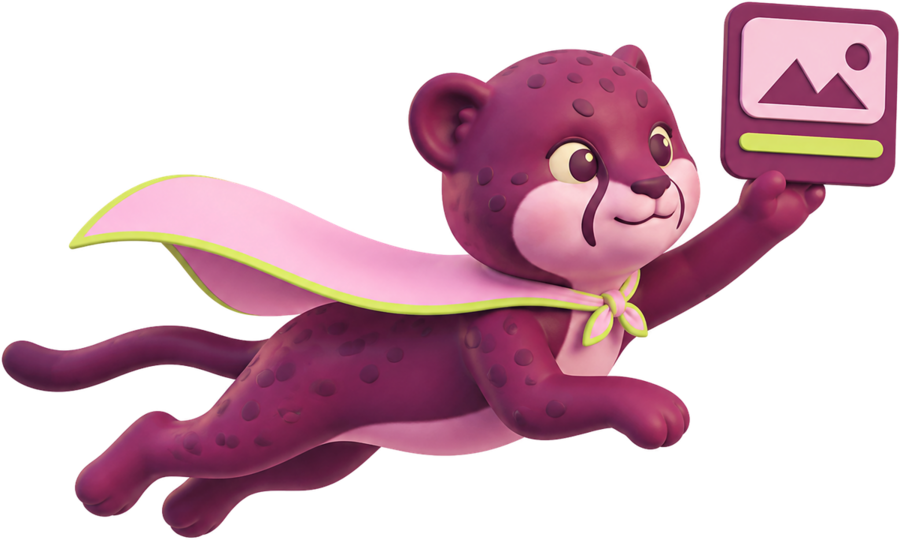
The cheetah appears on the site and in campaigns. It is not in the package and third parties may not use it, not even in a story. It represents NimboCDN speaking, and in someone else's hands it starts saying things we did not say. To illustrate a story, use the logo.
The internal rules, published here so people know what to expect. The mascot never replaces the symbol. It never appears in the favicon or the dashboard, and it only uses plum, lime and pink.
Delivering

Waving
10. Six ways to break this
Each one has its reason. These are not matters of taste: they are the things that make the symbol stop meaning what it means, or stop being legible.
✕ Stretch or distort it
The block sits at exactly 68% of the bounding box. Deforming it breaks the only piece of data the symbol carries.
✕ Recolour the block or the edge
Pink and lime are not interchangeable decoration: they are the knocked-out block and the edge. If you need a single ink, the mono version exists.
✕ Add a shadow, bevel or gradient
The symbol is flat by design. A gradient drops it back into the aesthetic of the category it separated itself from.
✕ Rotate or tilt it
The block and the edge are horizontal because the cut is vertical. Tilted, the gesture stops reading.
✕ Use the glyph symbol at 16 px
At that size the sun and the hills melt together. nimbocdn-symbol-small.svg exists, and it is measured: 0.882 retention against 0.807.
✕ Set the name in live type
The wordmark is outlines, with HarfBuzz kerning. Typing it in Bricolage gives different letterspacing — and with no font-weight declared, it comes out at 800.
11. What you may and may not do
The short rule: the name is permissive, the logo is restricted. Naming a trademark to refer to the product it names is legitimate use and needs no permission from us. Reproducing the logo artwork does.
You may, without asking us
- Write "NimboCDN" in text to refer to the product or the company.
- State that your site, theme or plugin works with NimboCDN, if that is true.
- Compare NimboCDN with other products, unfavourably included, as long as what you say is verifiable.
- Use the logo to link to nimbocdn.net, or as the icon on an integration button.
- Publish news, a review, a tutorial or a video about NimboCDN, using the logo and the captures from the press kit.
You may not
- Alter, recolour, rotate, distort, crop or redraw the logo — not even part of it.
- Use the name or the logo in your own company, product, domain, app or social handle.
- Lock our mark together with yours into a single block, or build a derivative logo.
- Imply a partnership, sponsorship, certification or endorsement that does not exist.
- Make our mark more prominent than your own on the same piece: your name and your logo have to be visibly larger.
- Sell merchandise carrying our mark, or place it alongside illegal or objectionable content.
Need a use that is not covered here? Write to press@nimbocdn.net with a mock-up of what you intend to do. We answer quickly.
12. Third-party marks
The WordPress logo appears on our site unaltered and only to indicate compatibility. WordPress is a trademark of the WordPress Foundation, and we have no affiliation with it. We apply to ourselves the rule we ask of others above.
The same holds for the products we compare: the comparisons name competitors in order to identify them, and nothing there implies association, sponsorship or endorsement by any of them.
13. The trademark and the contact
NimboCDN™ is a trademark of DIO Digital E-Commerce Services LLC.
If you need an attribution line on a piece, this one works:
NimboCDN and the NimboCDN symbol design are trademarks of DIO Digital E-Commerce Services LLC.
Permissions, questions and reports of misuse: press@nimbocdn.net.
14. Every file
476 KB ZIP
| What it is | Files |
|---|---|
| Horizontal logo | SVG · 512 · 1024 · 2048 · mono positive · mono negative |
| Vertical logo | SVG · 512 · 1024 · mono positive SVG · mono positive PNG · mono negative SVG · mono negative PNG |
| Symbol | SVG · 512 · 1024 · mono positive · mono negative · animated |
| Symbol for 16–48 px | SVG without glyph |
| Wordmark | SVG · 512 · 1024 · 2048 |
| Icons and favicons | favicon.ico · 16 · 32 · 48 · 180 · SVG · 256 · animated GIF |
| Colour and pattern | tokens JSON · palette SVG · pattern |
| Typefaces | Bricolage · Figtree · OFL · OFL |
| Product captures | Dashboard, free plan · Dashboard, Pro plan |


The typefaces are SIL Open Font License 1.1: they may be used and redistributed with the licence alongside, and may not be sold on their own. Everything else belongs to DIO Digital E-Commerce Services LLC and is governed by section 11.